During Corona the digital dashboard was set up to gather information in one platform and to improve the clarity of information. This dashboard enabled very precise measurements: the number of new patients in intensive care, the number of new hospitalizations and the number of positive test results. Similar dashboards have been developed before. Years before Corona, Somalia, for example, tracked a polio outbreak on a dashboard. “However, the dashboard was put on the map worldwide, because of the corona pandemic,” says Klazinga.
Intended for policy makers
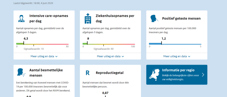
Countries everywhere began to set up their own dashboard, to inform the population. On June 5, the Dutch dashboard was launched. “People took what figures they had at hand,” says Klazinga, who scientifically described the dashboards in 158 countries. “Initially it was mainly intended for policy makers.” For instance, the figures were broken down by security regions rather than municipalities. Klazinga thinks that this strategy would increase citizen involvement. “Is your city in it? Is the virus in our area increasing or decreasing?” he outlines. By the time Klazinga's research group reviewed the dashboard in December 2020, all sorts of things had been added. Like the corona situation in different age groups and in nursing homes.
These were golden ages for the dashboard. Figures from the dashboard went around the media, were discussed on birthdays and downloaded by hobbyists, who ran their own analyses on them. And the site grew: visitors could check how many vaccines had been given, how many virus particles were in the sewers and which variants were circulating. Yet information was also missing, Klazinga believes. “I don't say that as a criticism, but as an observation.” For example, it might have made sense if the dashboard had also tracked insights from behavioral sciences: how faithfully do people adhere to measures, how concerned are people about the virus? These now only showed up on the site after the fact.
Balanced picture
Policy makers have benefited greatly from the broader picture, Klazinga believes. What is the economic impact of the measures, how many other medical treatments have been postponed? “You would want to bring out a more balanced picture,” he says. “The emphasis now was on epidemiology. Everyone was looking at the number of covid patients in the ICU, not the number of cancelled operations.”
But the ministry felt little interest in such readjustments, according to research Klazinga did on De Jonge's dashboard of ‘gauges and control lights’. Leave the interpretation of what is happening primarily to politicians and the Outbreak Management Team, reasoned the development team behind the dashboard. Above all, the site had to “inform a broad audience in an easy way about the current corona situation," according to the ministry.
And now, 750 million page views and three years and nine months later, the ministry will no longer maintain the dashboard. Visitor numbers were already declining sharply last year, and now less than five thousand people visit monthly. A big difference from the more than 1.3 million unique visitors who still visited the site in July 2022.
Infectious diseases in the spotlight
The National Institute for Public Health and the Environment (RIVM) is currently thinking about better ways to present all the national figures on infectious diseases on the Internet, from respiratory infections to STIs. “We notice that infectious diseases are attracting more attention. People want to know more about them,” says RIVM epidemiologist Susan van den Hof. “And the corona dashboard can be an example of how to do that in an accessible, understandable way.”
Researcher Klazinga, meanwhile, is thinking bigger. An umbrella dashboard that summarizes per country all kinds of statistics on public health locally, that is the dream he has kept from the corona dashboard. “From mortality and how a country deals with strokes, for example, to financial indicators and the number of healthcare personnel,” he says. However, there is one downside to such an umbrella dashboard, too much information can lead to lack of clarity. “You are soon talking about some 220 indicators per country,” says Klazinga.
Volkskrant article, written by Maarten Keulemans.